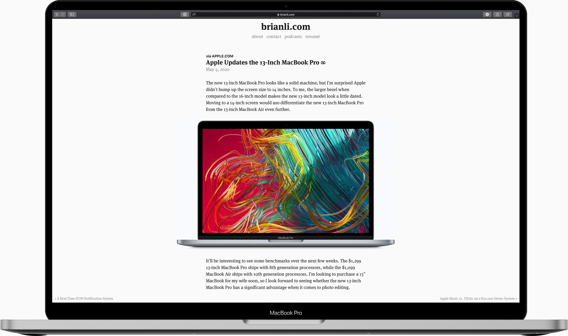
Today, I decided to add next and previous post links to the bottom corners of my single page template in Hugo. I purposely made them “fixed” to ensure people would see them even if they don’t scroll all the way to the bottom of the page.

Here’s the code I used to add this functionality.
<div class="next-post">
	{{ if .NextPage }}
	<a class="link-reverse" href="{{ .NextPage.Permalink }}?ref=footer">« {{ .NextPage.Title | truncate 50 "..." }}</a>
	{{ end }}
</div>

<div class="previous-post">
	{{ if .PrevPage }}
	<a class="link-reverse" href="{{ .PrevPage.Permalink }}?ref=footer">{{ .PrevPage.Title | truncate 50 "..."}} »</a>
	{{ end }}
</div>
Here’s a closeup view of the links. I’m not 100% sure how I feel about it. I like the idea, but I’m not sure if this is the correct execution in terms of design. I experimented with changing the font to a sans-serif, but it looked bad.

Right now, the links only appear for screens larger than 1680 pixels. I added a ?ref=footer query string to the link URLs, so I’ll monitor my analytics over the next few weeks for clicks. If the links don’t get any clicks, I’ll remove them.
Update (May 10, 2020) - I’ve decided to remove the links.