HEY is a new paid email experience designed and developed by Basecamp. I say “experience” when I describe HEY because I don’t think “service” or “platform” do it justice – it’s a complete rethinking of email. HEY takes an extremely opinionated view on email with its core features including the “Imbox”, “Screener”, “Feed”, and “Paper Trail” – more on that later.
In this article, I’ll give you my initial thoughts on HEY after using it for a week. I plan on following up with a more in-depth piece in a few months, but hopefully my first impression can help you decide if you want to give HEY a try.
Paid Email in 2020
Let’s address the elephant in the room first. In 2020, the majority of paid email services have one feature in common – custom domain support. For many, being able to use their domain of choice is something worth paying for. Take a look at Gmail, ProtonMail, and Outlook.
All three of these services have a free tier that uses their respective domains, and a paid tier that supports custom domains. So, why would anyone pay for a email service that doesn’t support custom domains in 2020?
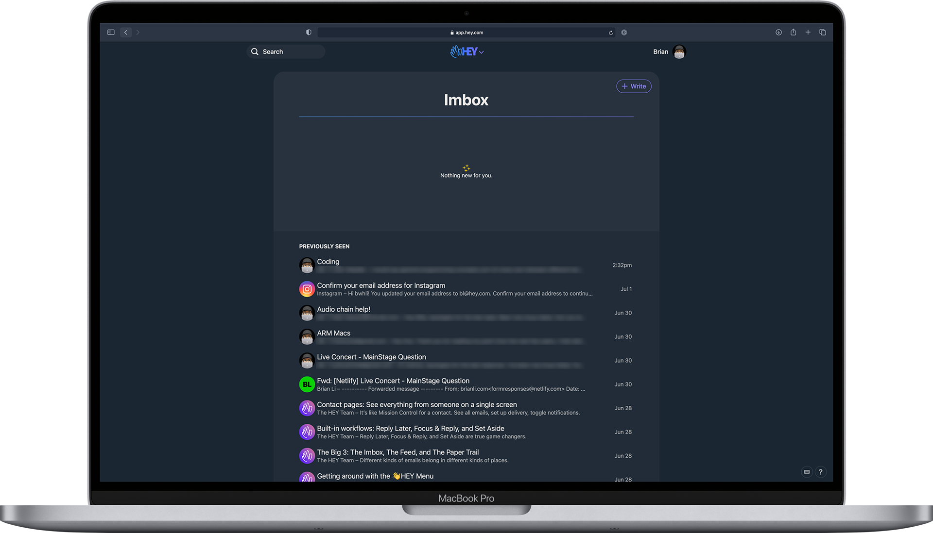
HEY's user interface – a more refined take on email.
When it comes to HEY, the answer is simple. You’re not paying for custom domain support. You’re paying for a revolutionary new take on email, and the associated joy it brings you.
At this stage, HEY is definitely not perfect, but if you’re only using the lack of custom domain support to judge HEY’s pricing model, you just don’t get it. Saying “Hey isn’t for me because it doesn’t support custom domains” is fine. However, only saying “Hey isn’t worth $99/year because it doesn’t support custom domains” without discussing the value of its features seems a little biased and doesn’t make much sense to me.
I’m sure I’ll have more to say over time. For now, I think HEY is worth the $99/year price tag for three reasons.
1. HEY is Inherently Valuable
Custom domains are important to some people, but definitely not to the majority of people. This means using custom domain support as a primary value quantifier is flawed in the context of mainstream adoption.
Instead of defaulting to the “only services that support custom domains should be paid” mindset, people should open their eyes and realize that a complete rebuild of email, with or without custom domain support, is also valuable.
2. HEY Saves Time, Time is Money
HEY’s core features (which I’ll get into more detail) later are useful and well executed for a V1 product. As I use it more and more, I can see how HEY will save me a lot of “email time” in the long term.
3. An Investment of Sorts in Basecamp
Basecamp is an incredible project management software. I personally don’t use it at the moment because I’m not a freelancer anymore, but I’ve used it in the past. I’m a huge fan of the company and its ethos.
Basecamp’s track record is actually the main reason I bought into HEY in the first place. I have faith that they’ll turn a decent V1 product into an incredible V2 product in the future. They can’t do that without financial support, so that’s why I’ve paid for not one, but two, HEY email accounts.
HEY’s Core Features
Now that we’ve estabished HEY is not a ripoff, let’s go over its four key features. I won’t go into too much details in this initial review because I’m still exploring HEY and forming new opinions day by day.
The Screener
One of HEY’s key selling points is the Screener. When you receive an email from a new address, HEY politely asks if you want to receive email from from said address. If you like having a door on your house, you’ll love the Screener.
The Imbox
The “imbox”, short for “important-box” (I assume), is HEY’s take on “inbox”. Unlike a typical email inbox which contains both read and unread items in a single unorganized stream that resembles zebra stripes (read and unread), HEY’s imbox takes a more organized approach by only displaying two kinds of emails – important and “previously seen”.
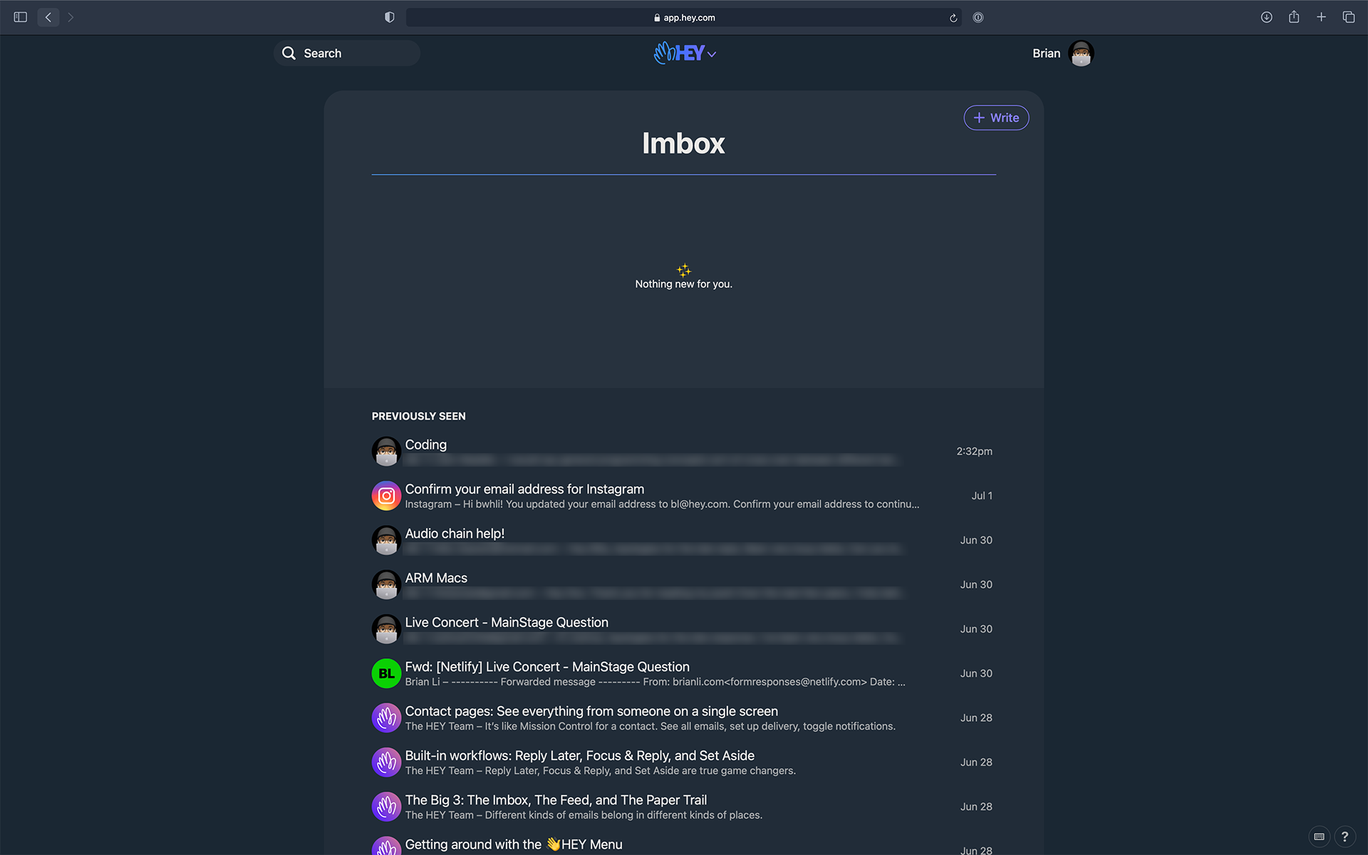
If you’re wondering what an important email is, it’s basically an email that makes it past the Screener and doesn’t belong in the Feed or Paper Trail. Practically speaking, after training the Screener over time, the only emails that end up in your imbox will be the important conversations that matter to you.
The Feed
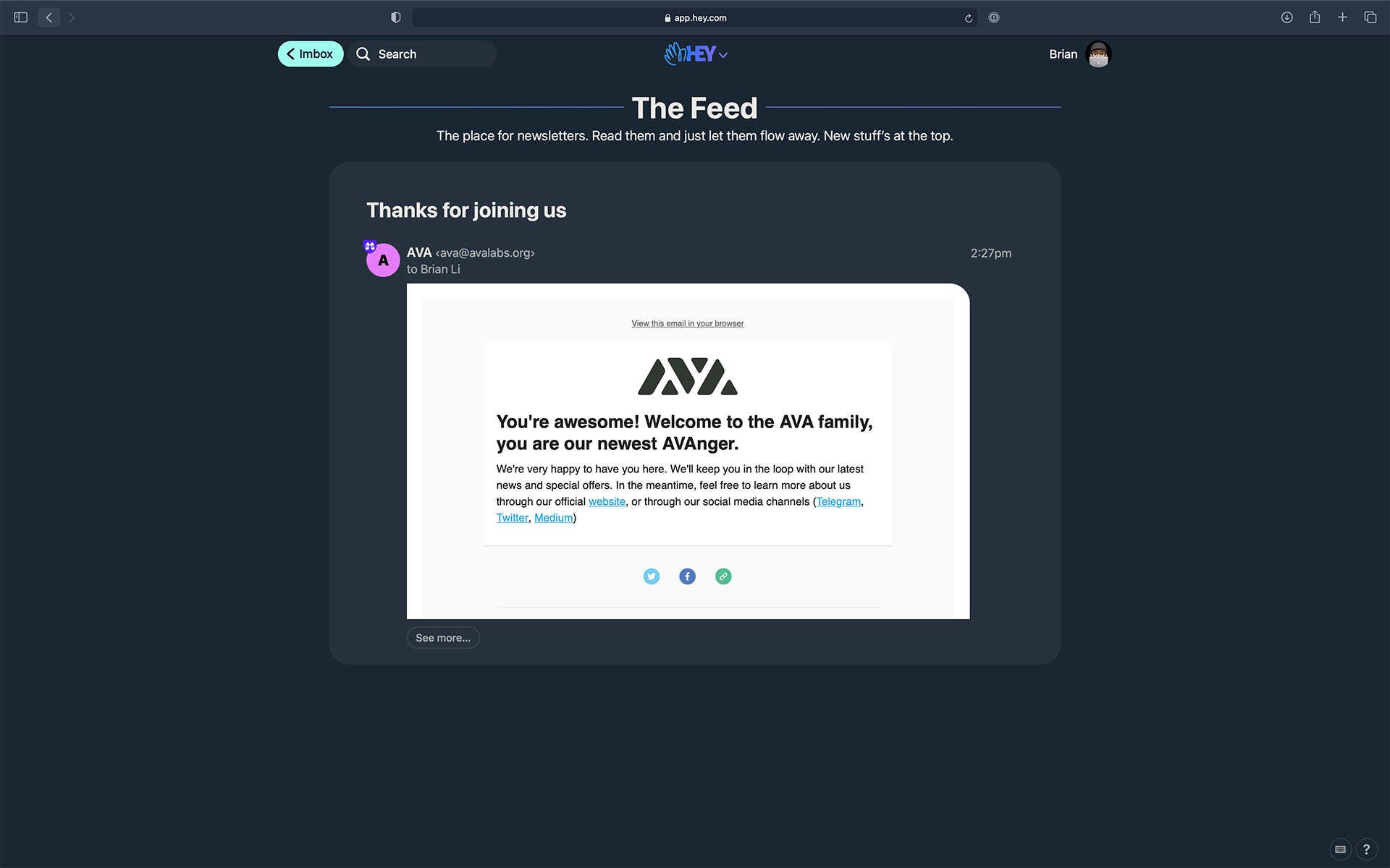
The Feed is where newsletters go. I don’t have enough emails in my Feed yet, but the idea here is that HEY will display emails in the Feed in a Twitter-esque fashions. This allows you to endlessly scroll through your newsletters without having to open and close individual emails. I love the idea.
The Paper Trail
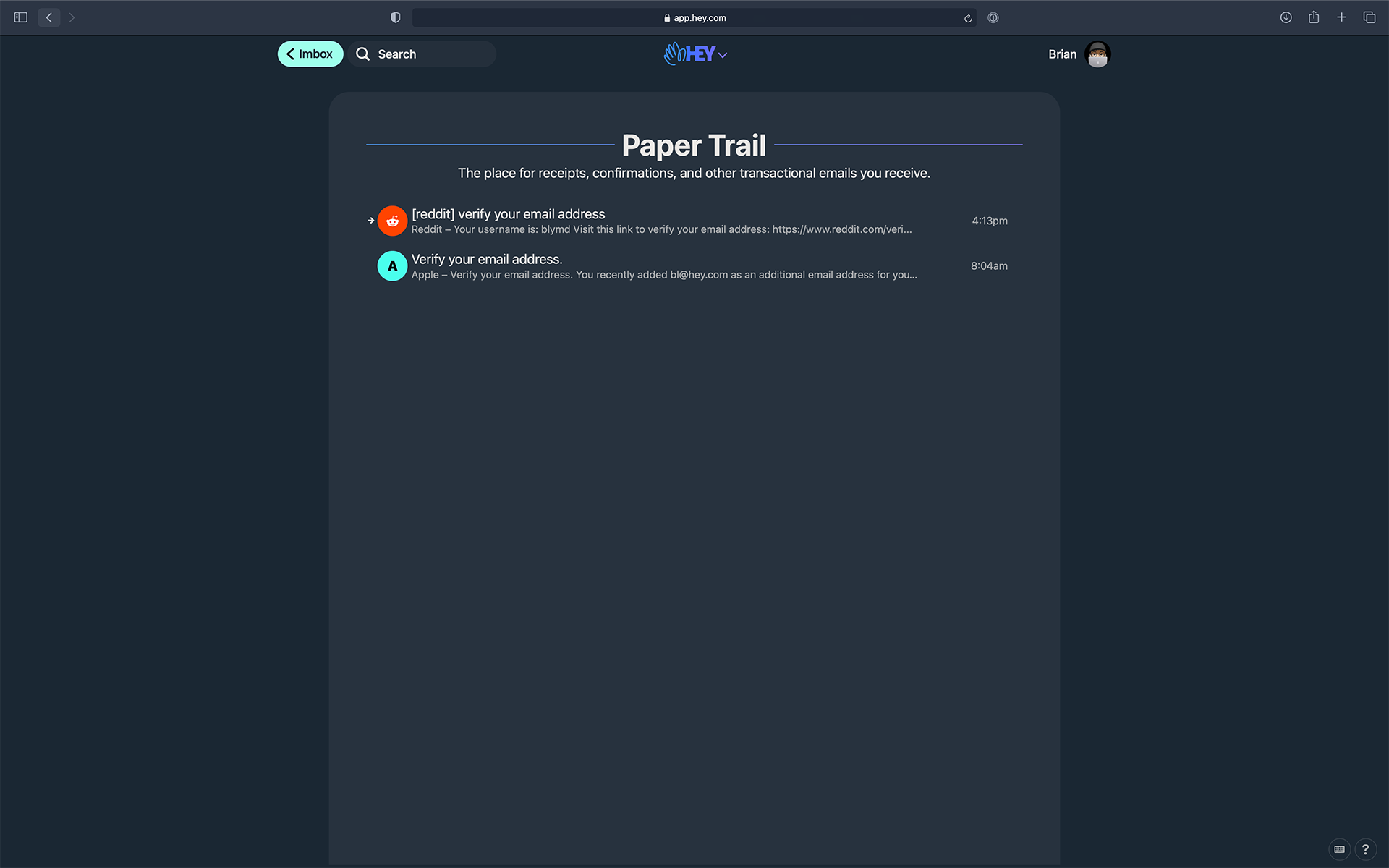
The Paper Trail is for receipts, email confirmations, and other transactional-type emails. This is one of my favorite features of HEY because I really hate seeing receipts in my inbox – mostly because they serve as a constant reminder of money being spent. At the same time, I don’t want to delete them because they’re very useful for tax season. With this in mind, being able to lock them away in HEY’s Paper Trail is pretty great.
“Reply Later” and “Focus & Reply”
Like many people, I don’t respond to non-urgent emails immediately. When I receive a non-urgent email, I typically read it, mark it unread, and move on with my day. Ever since I started using HEY, the concept of reading an email and then immediately marking it unread feels antiquated and dumb.
HEY handles non-urgent emails with its “Reply Later” and “Focus & Reply” features. If you don’t want to respond to an email immediately after reading it, just click Reply Later. When you’re ready to respond to the emails, go into Focus & Reply mode and knock out responses one by one. Focus & Reply is a great user experience, and feels very productive.
Native Apps
In addition to the HEY web app, there are also apps for iOS, Android, macOS, Windows, and Linux. At the moment, I’m only using the app on iPhone and iPad. On my MacBook Pro, I use the webapp in Safari.
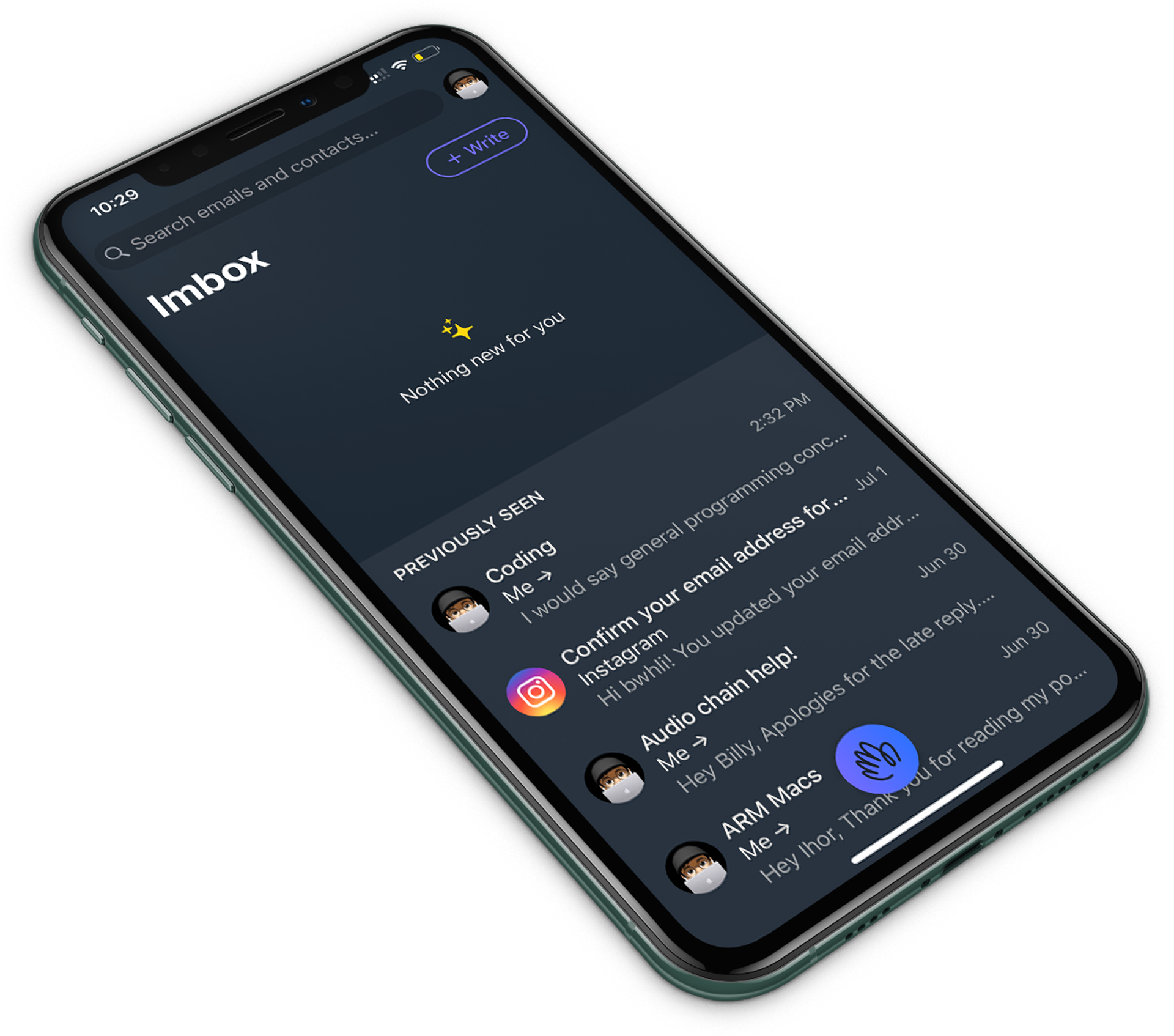
I don’t have too much to say about the iOS app. According to HEY, it’s a native Swift app, and it performs like one – fast and responsive. I’m glad HEY didn’t use Ionic or some other JavaScript framework to build the mobile apps.
The Gmail Filter Argument
HEY’s strengths lie in its abstraction of complex workflows and features. Entire industries and billion-dollar businesses have been built on the concept of simplifying complex things, and HEY is no different.
One of the most common arguments against HEY (a paid product), is the idea that it’s possible to replicate some of its features to a certain extent with Gmail (a free product) filters. There are a few things wrong with this criticism.
Qualifier Paradise
This comparison involves qualifiers like “some” and “certain extent”. The inclusion of these qualifiers in HEY-Gmail comparisons only demonstrates one thing – it’s not possible to replicate HEY with Gmail.
The Value of Abstraction
The vast majority of email users are not going to sit around and fiddle with filters and workflows in Gmail. Everyone can make a cup of coffee, but people still go to Starbucks and pay through the nose for coffee. Everyone can learn how to fix their kitchen sink, but there is still demand for plumbers.
There is immense value in abstraction, and HEY has done a good job of distilling complex logic into a few simple features that are easy to understand. If you want to spend time tinkering with filters in Gmail to avoid paying $8.25/month, then Gmail is for you. For people who want to use a neatly packaged and intuitive product without self-induced mental ovehead, there’s HEY.
A Few Additional Thoughts
I’m a happy user of HEY, but I can honestly say it’s not perfect – not even close. Here are a few additional thoughts about the current state of HEY, and how I think it can improve in the future.
I Love the User Interface
HEY’s user interface is controversial. Some people think it’s too cute, others think the fonts are too big. I personally love it. It’s very functional and Basecamp-esque. I hope they don’t change the look.
Screener Needs to Be Improved
The Screener needs some improvement in terms of granularization. Right now, it can only make decisions based on email address, and completely ignores the contents of the email. In other words, there is currently no way to tell HEY to put some emails from a specific email address in the Imbox and another email from the same address in the Feed.
I haven’t thought about it too much, but I’d like to see some see a customizable second layer to the Screener for these edge cases.
I Got Two HEY Email Addresses
Earlier, I mentioned I paid for two HEY email address. I did this for two reasons. First, and most importantly, I wanted to support Basecamp and HEY’s privacy-centric quest to redefine email in an extremely crowded space occupied by the likes of Google, Microsoft, and other tech giants.
I think what HEY is attempting to do is worthy of praise, and I’m more than happy to put my money where my mouth is.
Secondly, I really do enjoy using HEY and wanted one address for personal correspondence and another one for business-related emails.
A Smart Pricing Model
HEY’s pricing model for premium two and three letter email address is very smart. Normal addresses cost $99/year, three-letter addresses are $349/year and two-letter addresses go for $999/year.
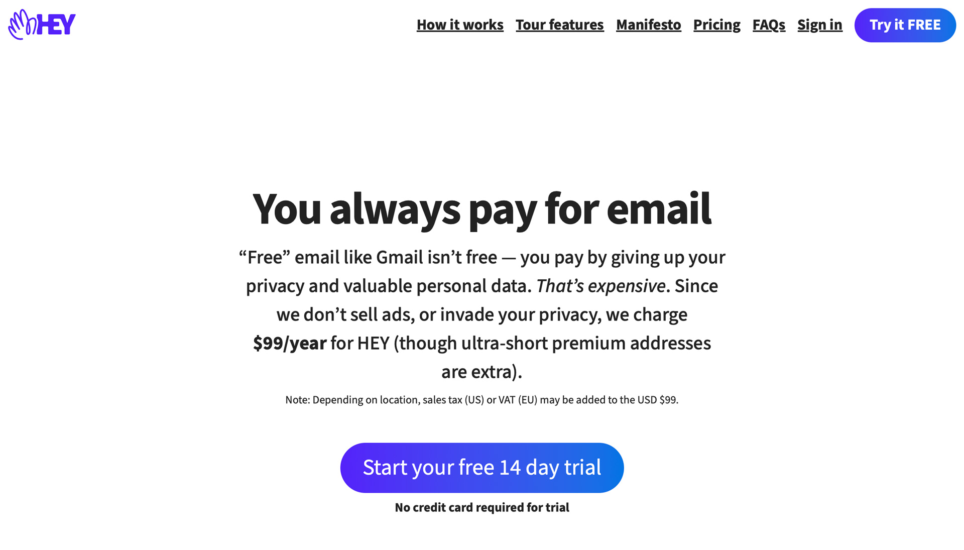
HEY pricing starts at $99.
Interestingly enough, paying for an address for a single year will reserve it forever. This means if you pay for a two letter address for one year and decide to cancel afterward, you’ll still be able to forward emails to another address.
This appeals to both “real users” of HEY and people who are just here for the FOMO. This is super smart, and I think it’ll help HEY recoup faster.
I’m looking forward to see how HEY evolves over the coming months and years. Have you tried out HEY already? If not, are you going to? Let me know your thoughts on Twitter or via email.