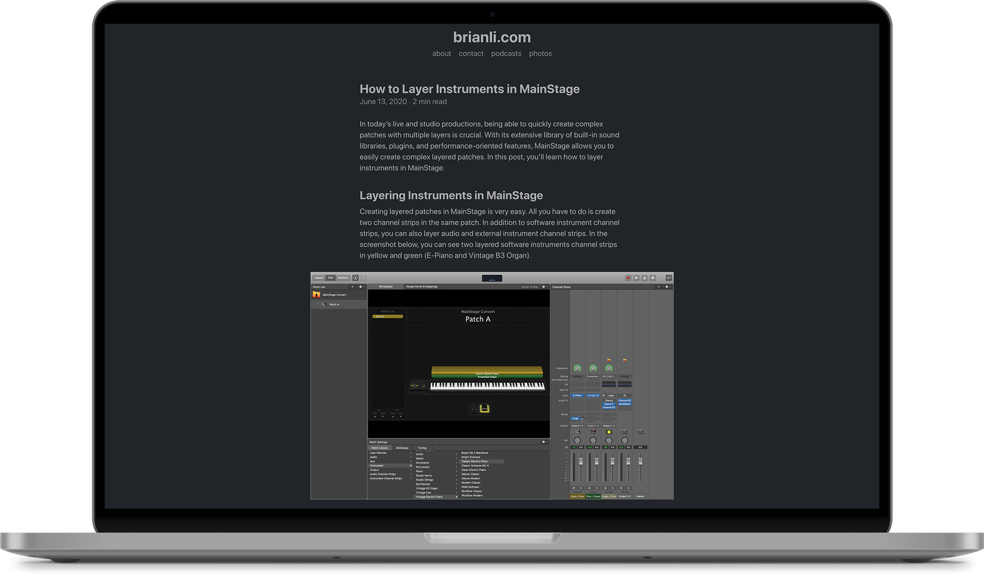
I’m a huge proponent of using system fonts for websites. Using system fonts is great for website performance because it doesn’t require the client to download additional fonts to render a page. I think modern system fonts look beautiful as well, especially the San Francisco font that ships with macOS and iOS.
I love how the system font stack looks in dark mode. Very clean and sleek.
In the past, I used system fonts on this website. At some point, I switched to FF Meta Serif because Chrome, Brave, and other Chromium-based browsers somehow broke system font rendering on macOS. I opened a ticket regarding the spacing issue back in December 2019, and it was resolved recently.
I have to admit that I sort of miss the serif look, and I’m really glad that I stumbled upon FF Meta Serif during my font hunting because it’s a great font. With that said, I also love the reduced performance overhead that a system font stack brings to the table. I’m going to give the system font stack another shot, and see how I feel about it over the next few months. If I really miss the serif look, I can always switch back to FF Meta Serif.
Here’s the system font stack I’m using from CSS-Tricks.
body {
  font-family: system-ui, "Segoe UI", Roboto, Helvetica, Arial, sans-serif, "Apple Color Emoji", "Segoe UI Emoji", "Segoe UI Symbol";
}
Let me know what you think of the new font!